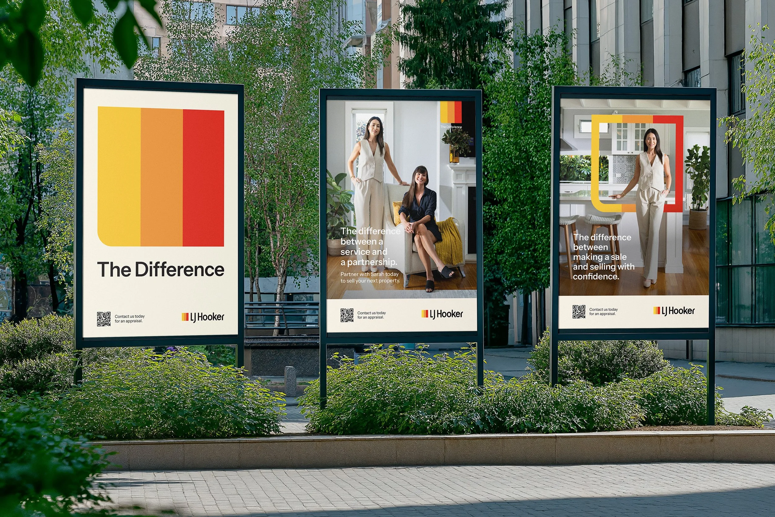
THE DIFFERENCE
LJ HOOKER
Bringing renewed confidence and consistency to a legacy brand built for growth.
With almost a century of heritage, LJ Hooker remains one of Australia’s most established property brands. The opportunity was to modernise the business for today’s market while strengthening the trust, familiarity and presence that made it iconic.
The Challenge
Like many long-standing brands, LJ Hooker had strong equity but an ageing visual system.
The identity relied heavily on a limited colour palette, dated assets and generic category photography that offered little distinction from competitors. Across a large franchise network, inconsistent use of core brand elements often weakened recognition and reduced cohesion.
The challenge was not to reinvent LJ Hooker, but to give the business a clearer, stronger and more scalable system to grow from.
The Response
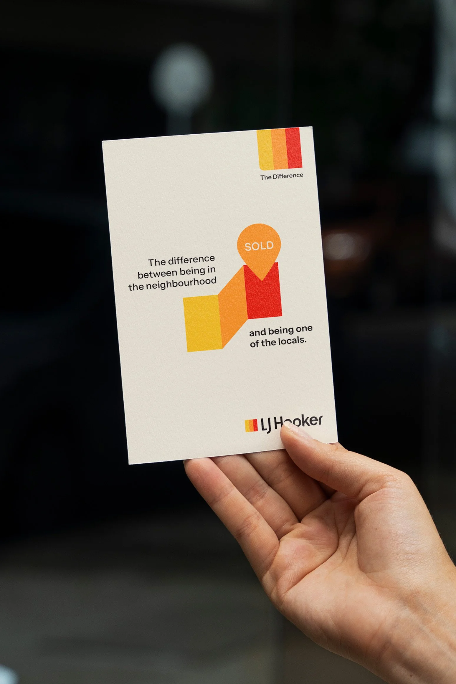
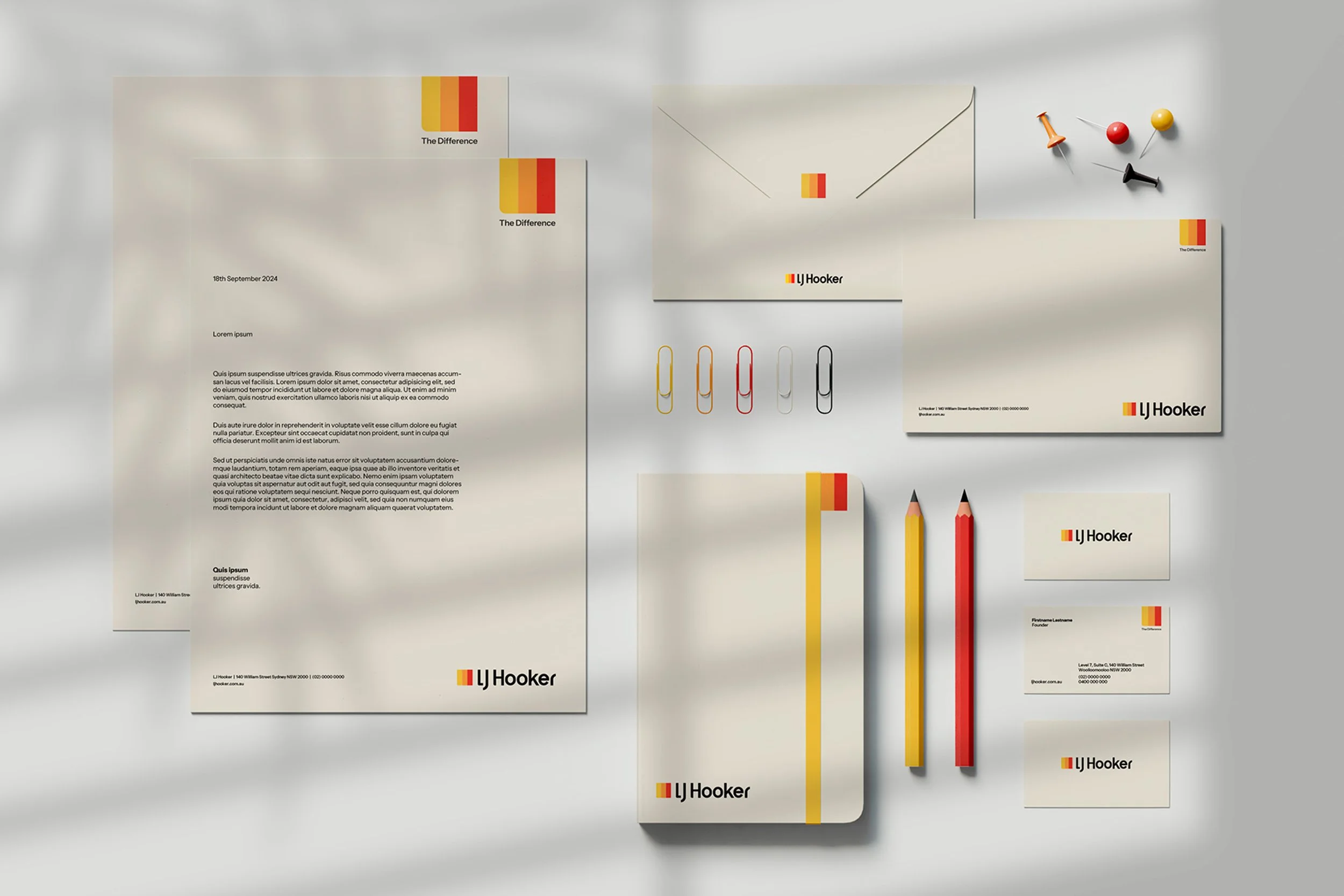
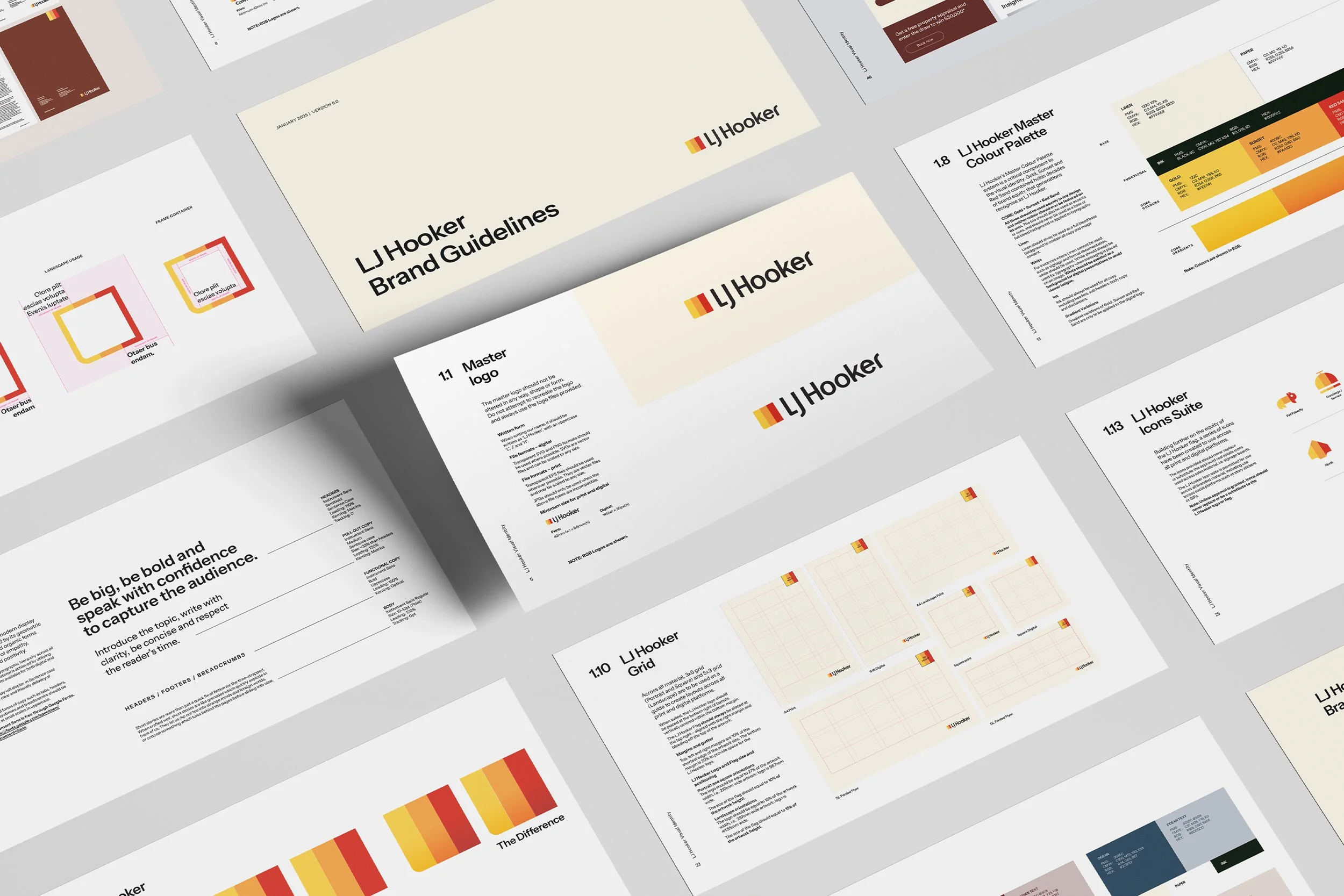
We refined the existing logo to improve balance, confidence and consistency, retaining recognisable equity while removing awkward details that had accumulated over time.
A broader colour system was introduced, inspired by Australian homes, landscapes and lifestyle. This allowed the iconic yellow, orange and red to remain hero assets, while providing a more disciplined and flexible palette for everyday use.
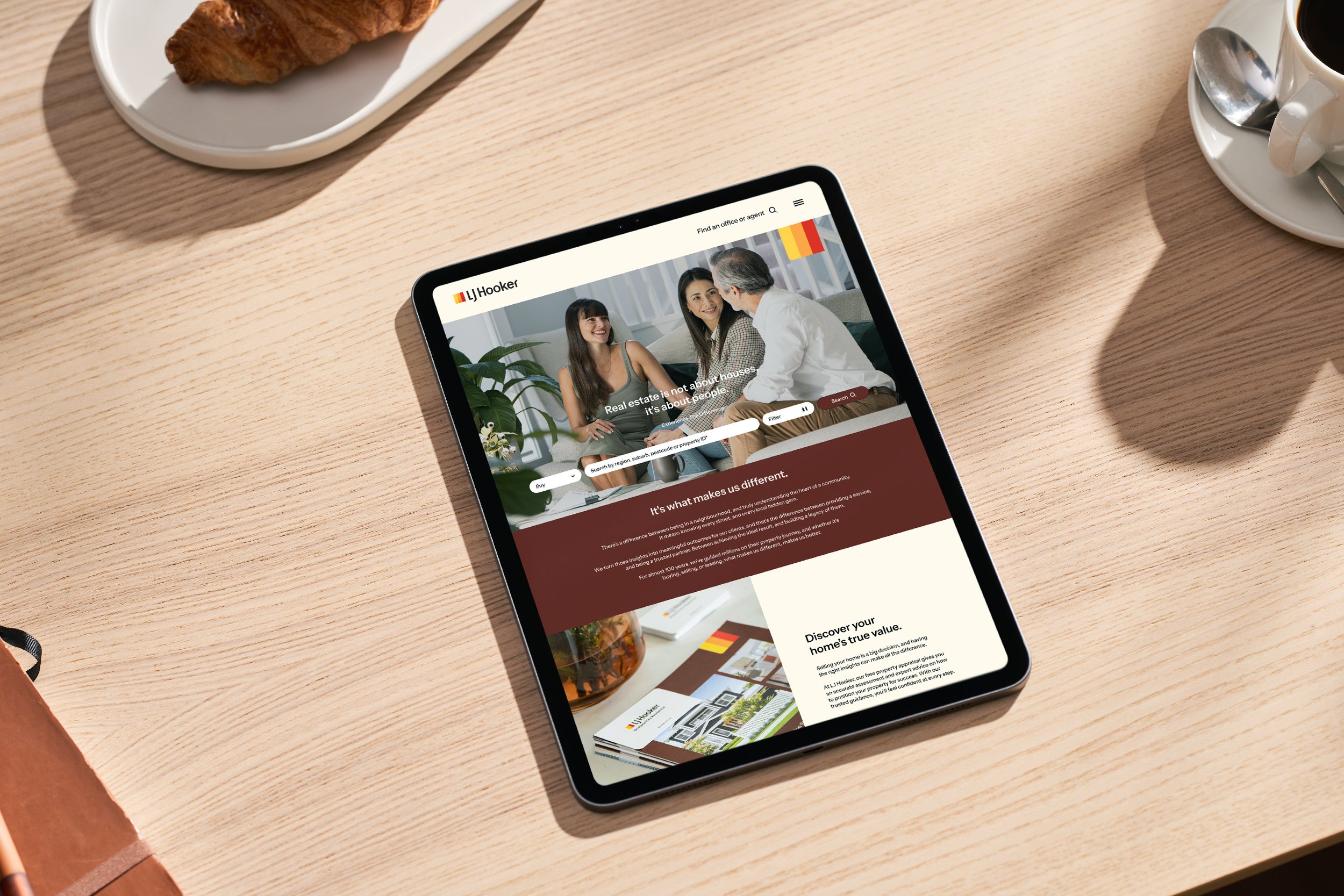
Photography was repositioned around the relationship between agents and clients — shifting the brand away from transactional category norms toward something more human, accessible and partnership-led.
We also evolved the well-known three-bar icon into a dynamic flag device. No longer static, it became a more expressive brand symbol designed to move, transform and work fluidly across digital, print and environmental applications.
To support national rollout, I led the creation of comprehensive brand guidelines covering logo systems, colour hierarchy, typography, imagery, layouts, campaign applications and network usage standards.
The Outcome
The refreshed identity launched nationally across a network of more than 500 agencies, creating a clearer and more distinctive brand presence across customer touchpoints.
Adoption across franchise partners was strong, supported by a practical system designed for real-world use. The renewed identity has also contributed to growing appeal among prospective future partners entering the network.
My Role
Creative Lead across identity evolution, brand guidelines, rollout systems, art direction and production.
Responsible for logo refinement, colour strategy, visual system development, national guidelines creation, photography direction, stakeholder engagement and close collaboration with internal marketing teams to ensure the brand was functional, scalable and effective across all touchpoints.
WEBSITE


SELECTED PROJECTS
-
![]()
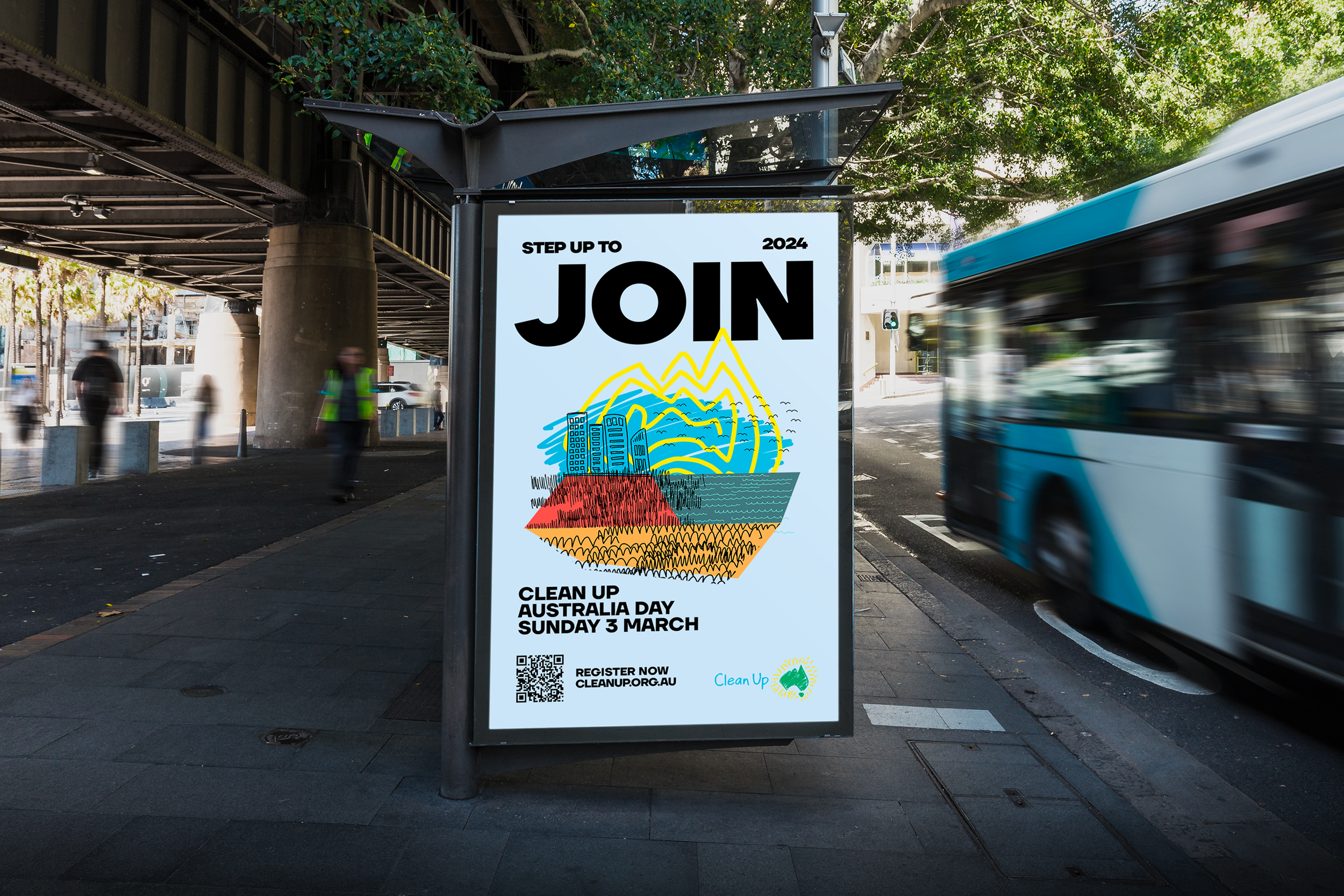
CLEAN UP AUSTRALIA BRAND EVOLUTION
-
![]()
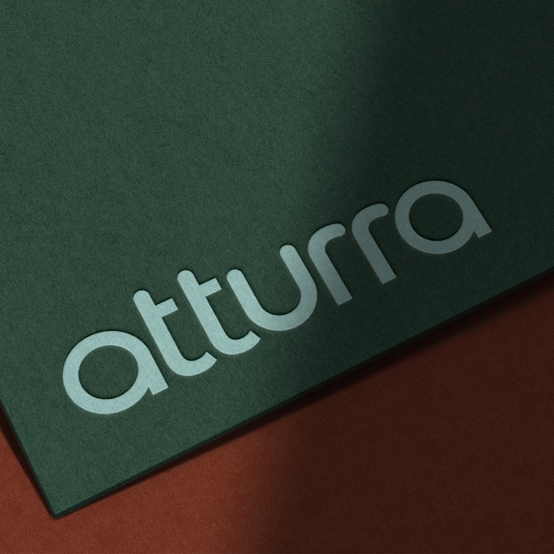
ATTURRA BRAND RALLY CRY
-
![]()
LJ HOOKER BRAND REFRESH
-
![]()
ZAMBRERO
-
![]()
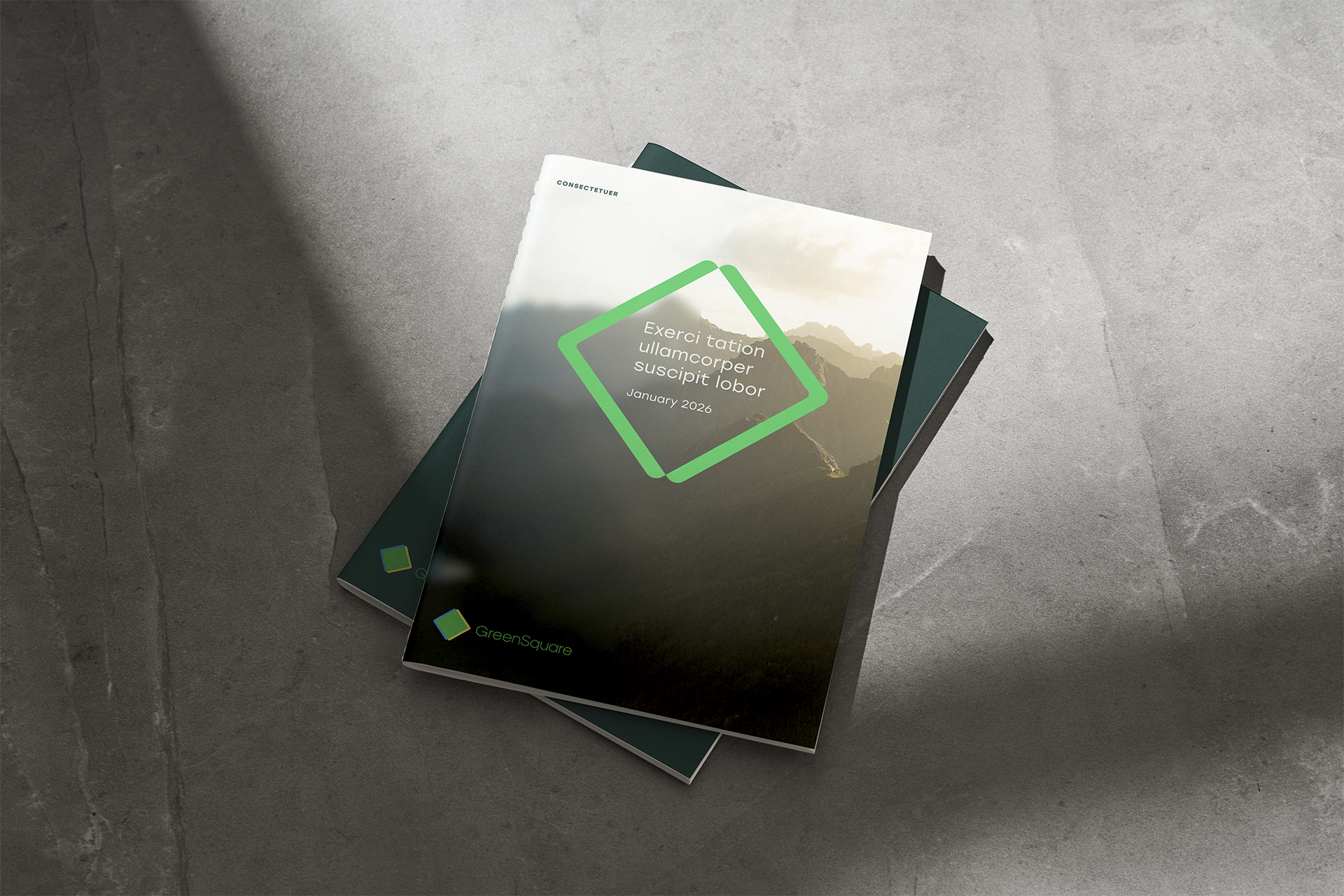
GREENSQUARE